DjangoプロジェクトでChart.jsを使ってグラフを表示させる方法です。
例えばDjangoで家計簿アプリを作っているとして、支出を記録するモデルを題材としていきます。
from django.db import models

class PaymentCategory(models.Model):
    """支出カテゴリ"""
    name = models.CharField('カテゴリ名', max_length=32)

    def __str__(self):
        return self.name


class Payment(models.Model):
    """支出"""
    date = models.DateField('日付')
    price = models.IntegerField('金額')
    category = models.ForeignKey(PaymentCategory, on_delete=models.PROTECT, verbose_name='カテゴリ')
    description = models.TextField('摘要', null=True, blank=True)
集計処理で使うので、以下のライブラリを読み込んでおきましょう。
pip install django-pandas
pip install pandas
データの確認
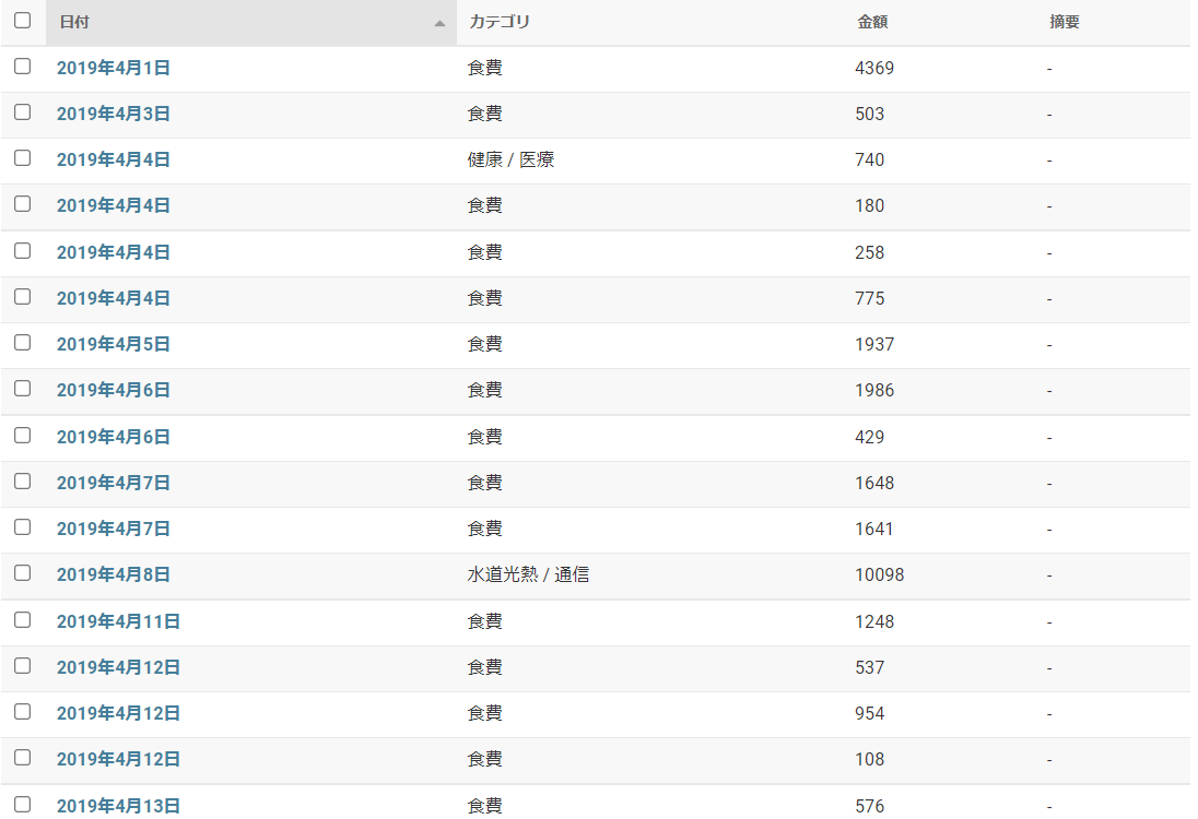
管理画面のキャプチャですが、このように支出をひたすら記録しているような感じです。
折れ線グラフの表示
ビューですが、基本的にはgeneric.TemplateViewをつかっていきます。
class ChartJsView(generic.TemplateView):
    template_name = 'kakeibo/chartjs.html'
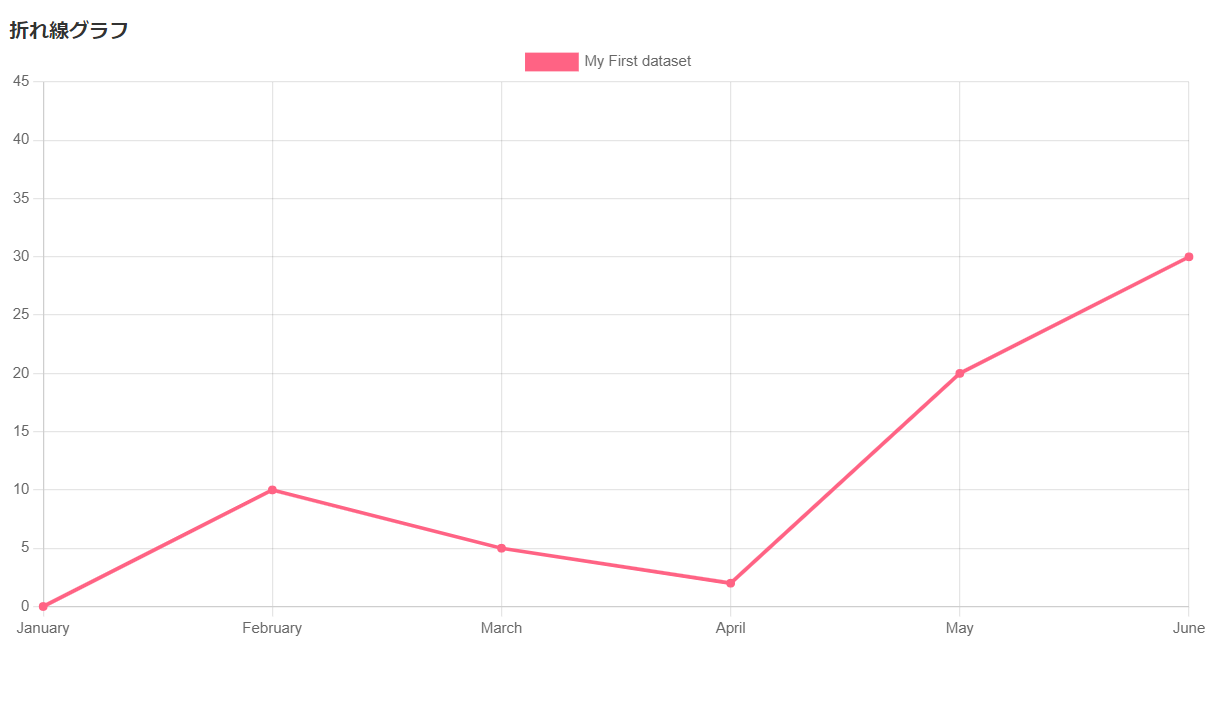
まずは\簡単なグラフを表示させてみましょう。
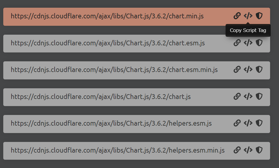
Chart.jsはCDN読み込みをすると簡単に使用できます。
以下のサイトからScriptタグをコピーしましょう。
https://cdnjs.com/libraries/Chart.js
コピーしたらtemplateに張り付けて以下のようにします。
{% extends 'kakeibo/base.html' %}
{% block content %}

<h1>折れ線グラフ</h1>
<div>
  <!-- 描画領域 -->
  <canvas id="lineChart"></canvas>
</div>
<!-- コピーしたScriptタグを貼り付け -->
<script src="https://cdnjs.cloudflare.com/ajax/libs/Chart.js/3.6.2/chart.min.js"
integrity="sha512-tMabqarPtykgDtdtSqCL3uLVM0gS1ZkUAVhRFu1vSEFgvB73niFQWJuvviDyBGBH22Lcau4rHB5p2K2T0Xvr6Q=="
crossorigin="anonymous"
referrerpolicy="no-referrer">
</script>
<script>
  const lineChartCtx = document.getElementById('lineChart').getContext('2d');
  // X軸データ
  const lineChartLabels = [
    'January',
    'February',
    'March',
    'April',
    'May',
    'June',
  ];

  const lineChartData = {
    labels: lineChartLabels,
    datasets: [{
      label: 'My First dataset',
      backgroundColor: 'rgb(255, 99, 132)',
      borderColor: 'rgb(255, 99, 132)',
      // Y軸データ
      data: [0, 10, 5, 2, 20, 30, 45],
    }]
  };

  const lineChart = new Chart(lineChartCtx, {
    type: 'line',
    data: lineChartData,
  });
</script>
{% endblock %}
このように表示がされます。
モデルのデータを反映させる
現状、Script内に直接値を打ち込んで表示をさせています。
モデルのデータを反映させるようにしていきましょう。
以下の部分を動的に作っていくイメージです。
// X軸データ
const lineChartLabels = [
    'January',
    'February',
    'March',
    'April',
    'May',
    'June',
  ];
...
const lineChartData = {
    labels: lineChartLabels,
    datasets: [{
      ...
      // Y軸データ
      data: [0, 10, 5, 2, 20, 30, 45],
    }]
  };
ビューを以下のように編集してcontextにデータを持たせます。
import pandas as pd
from django_pandas.io import read_frame
...
class ChartJsView(generic.TemplateView):
    template_name = 'kakeibo/chartjs.html'

    def get_context_data(self, **kwargs):
        context = super().get_context_data(**kwargs)
        payment_queryset = Payment.objects.all()
        df_line = read_frame(payment_queryset,
                             fieldnames=['date', 'price'])
        df_line['date'] = pd.to_datetime(df_line['date'])
        df_line['month'] = df_line['date'].dt.strftime('%y-%m')
        df_line = pd.pivot_table(df_line, index='month', values='price', aggfunc=np.sum)
        months = [month for month in df_line.index.values]
        payments = [val[0] for val in df_line.values]
        context['months'] = months
        context['payments'] = payments

        return context
django-pandasのreadframeを用いて、クエリセットをデータフレーム化します。
ここの部分ですね。
df_line = read_frame(payment_queryset,
                             fieldnames=['date', 'price'])
その後pandasの機能を使って日付データを元にmonthカラムを作成します。
あとはpivot集計すれば月間の集計が得られます。テストprintしてみましょう。
df_line = pd.pivot_table(df_line, index='month', values='price', aggfunc=np.sum)
print(df_line)
>>>
        price
month
19-04  186168
19-05  187341
19-06  103489
19-07  105725
19-08  117152
19-09  225781
...
以上のようにindexにmonthデータ、valueに合計値で集計がされます。
その後、templateで処理がしやすいようにリストに変換しています。
months = [month for month in df_line.index.values]
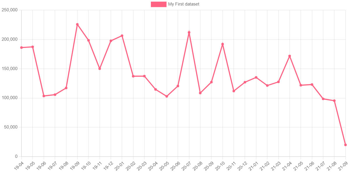
payments = [val[0] for val in df_line.values]あとはtemplate内のJavaScript内で値を入れていくだけです。
const lineChartLabels = [
    {% for month in months %}
    '{{ month }}',
    {% endfor %}
  ];
...
const lineChartData = {
    labels: lineChartLabels,
    datasets: [{
      ...
      // Y軸データ
      data: [
        {% for payment in payments %}
        {{ payment }},
        {% endfor %}
      ],
    }]
  };
このように表示がされます。
ドーナッツグラフの表示
せっかく支出をカテゴリごとに分けているので、カテゴリごとの支出がどうなっているのかグラフで表示させてみましょう。
ドーナッツグラフを作ってみます。
viewを以下のように編集します。
class ChartJsView(generic.TemplateView):
    template_name = 'kakeibo/chartjs.html'

    def get_context_data(self, **kwargs):
        context = super().get_context_data(**kwargs)
        payment_queryset = Payment.objects.all()
        ...
        context['months'] = months
        context['payments'] = payments
        # ここから追加
        df_donut = read_frame(payment_queryset, fieldnames=['category', 'price'])
        df_donut = pd.pivot_table(df_donut, index='category', values='price', aggfunc=np.sum)
        categories = [category for category in df_donut.index.values]
        payments_of_category = [val[0] for val in df_donut.values]
        context['categories'] = categories
        context['payments_of_category'] = payments_of_category

        return context
やっていることはさっきと同じでカテゴリーごとに金額を集計してcontextに渡しています。
あとはtemplateで読み込んで表示させましょう。
{% extends 'kakeibo/base.html' %}
{% block content %}

<h1>折れ線グラフ</h1>
<div>
  <!-- 描画領域 -->
  <canvas id="lineChart"></canvas>
</div>
<!-- 追加 -->
<h1 style="margin-top:30px">ドーナッツ</h1>
<div>
  <canvas id="donutChart"></canvas>
</div>

<!-- コピーしたScriptタグを貼り付け -->
<script src="https://cdnjs.cloudflare.com/ajax/libs/Chart.js/3.6.2/chart.min.js"
integrity="sha512-tMabqarPtykgDtdtSqCL3uLVM0gS1ZkUAVhRFu1vSEFgvB73niFQWJuvviDyBGBH22Lcau4rHB5p2K2T0Xvr6Q=="
crossorigin="anonymous"
referrerpolicy="no-referrer">
</script>
<script>
  const lineChartCtx = document.getElementById('lineChart').getContext('2d');
  ...
  const lineChart = new Chart(lineChartCtx, {
    type: 'line',
    data: lineChartData,
  });

  // ここから追加
  const donutChartCtx = document.getElementById('donutChart').getContext('2d');

  const donutChartLabels=[
    {% for category in categories %}
    '{{ category }}',
    {% endfor %}
  ]

  const donutChartData = {
    labels: donutChartLabels,
    datasets: [{
      label: 'Donut Chart ',
      // Y軸データ
      data: [
        {% for payment in payments_of_category %}
        {{ payment }},
        {% endfor %}
      ],
    }]
  };

  const donutChart = new Chart(donutChartCtx, {
    type: 'doughnut',
    data: donutChartData,
  });
</script>
{% endblock %}
このように表示されます。
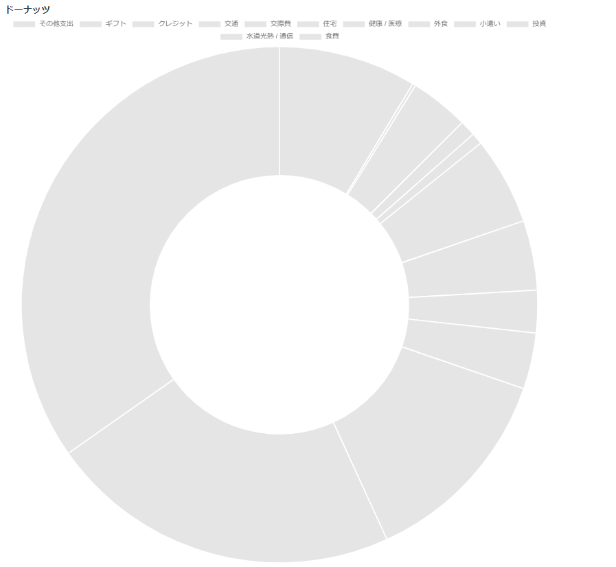
色の指定をしていないので、すべて灰色で表示されています。
カテゴリ別の色の表示はすこし厄介です。
一つずつ指定してもいいのですが、カテゴリは状況に応じて増えたり減ったりしそうです。
なので、動的に設定するようにしましょう。
以前に書いたseabornのカラーパレットを使用する方法を採用します。
Djangoで作る家計簿アプリ ⑤月間支出ダッシュボードの作成、グラフの表示
seabornのカラーパレットのrgb値を書き出したseaborn_colorpalette.pyを作成します。
"""seadbornのカラーパレットの定義"""


def sns_paired():
    return ['rgb(166.65098039215687,206.8078431372549,227.89019607843136)',
            'rgb(31.12156862745098,120.47058823529412,180.7058823529412)',
            'rgb(178.69803921568626,223.87450980392157,138.54117647058823)',
            'rgb(51.2,160.62745098039215,44.17254901960784)',
            'rgb(251.98431372549018,154.60392156862744,153.6)',
            'rgb(227.89019607843136,26.101960784313725,28.109803921568627)',
            'rgb(253.9921568627451,191.74901960784314,111.43529411764706)',
            'rgb(256.0,127.49803921568628,0.0)',
            'rgb(202.7921568627451,178.69803921568626,214.8392156862745)',
            'rgb(106.41568627450981,61.23921568627451,154.60392156862744)',
            'rgb(256.0,256.0,153.6)',
            'rgb(177.69411764705882,89.34901960784313,40.15686274509804)',
            'rgb(166.65098039215687,206.8078431372549,227.89019607843136)',
            'rgb(31.12156862745098,120.47058823529412,180.7058823529412)',
            'rgb(178.69803921568626,223.87450980392157,138.54117647058823)',
            'rgb(51.2,160.62745098039215,44.17254901960784)',
            'rgb(251.98431372549018,154.60392156862744,153.6)',
            'rgb(227.89019607843136,26.101960784313725,28.109803921568627)',
            'rgb(253.9921568627451,191.74901960784314,111.43529411764706)',
            'rgb(256.0,127.49803921568628,0.0)',
            'rgb(202.7921568627451,178.69803921568626,214.8392156862745)',
            'rgb(106.41568627450981,61.23921568627451,154.60392156862744)',
            'rgb(256.0,256.0,153.6)',
            'rgb(177.69411764705882,89.34901960784313,40.15686274509804)']
view内で読み込んでcontextに値を持たせます。
from .seaborn_colorpalette import sns_paired
...

class ChartJsView(generic.TemplateView):
    template_name = 'kakeibo/chartjs.html'

    def get_context_data(self, **kwargs):
        ...
        color_map = sns_paired()
        context['color_map'] = color_map[0:len(categories)]
JavaScriptに追記します。
const donutChartData = {
    labels: donutChartLabels,
    datasets: [{
      label: 'Donut Chart ',
      // Y軸データ
      data: [
        {% for payment in payments_of_category %}
        {{ payment }},
        {% endfor %}
      ],
      // 追加
      backgroundColor: [
        {% for c in color_map %}
        '{{ c }}',
        {% endfor %}
    ],
    }]
  };
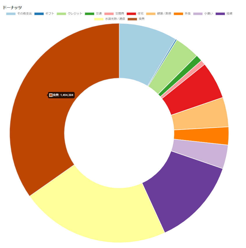
カラフルになりました。
 Share
Share