Djangoで作る家計簿アプリシリーズの五つ目の記事です。
今回は月間支出のダッシュボードを作成していきます。
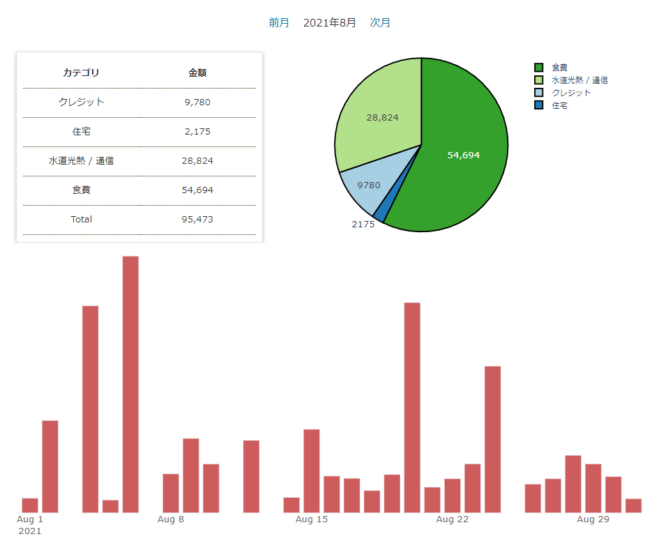
このように月ごとにカテゴリごとの支出の合計金額、割合を示す円グラフ、日別の推移グラフを表示していきます。
グラフ部分はplotly、計算はpandasを使って行っています。
必要ライブラリ
「Djangoで作る家計簿アプリ ①プロジェクトの初期設定」で必要ライブラリについて記載しました。
まだの方はプロジェクトにinstallしておきましょう。
pip install django-pandas
pip install pandas
pip install plotly
URLパターンの追加
おなじみで追加をしていきます。
#kakeibo/urls.py
...
urlpatterns = [
    ...
    path('month_dashboard/<int:year>/<int:month>/', views.MonthDashboard.as_view(), name='month_dashboard'),
]
月別に表示したいので、yearとmonthを指定します。
現在年と現在月の共通contextの設定
ここで、共通のコンテクストを作成しておきましょう。
月別のダッシュボードなので、最初にアクセスしたときは現在の年月のページを表示したいです。
先ほど作成したurlに渡すのは簡単ですが、今回はページリンクをbase.html内のヘッダーに持たせています。
そのため、すべてのviewに現在の年月情報を渡す必要が出てきます。
とはいえ、その都度書くのはあまりスマートとは言えません。
Djangoでは簡単に共通コンテクストを設定できるので、そちらを利用していきます。
まずアプリ内にmy_context_processor.pyを作成します。
#kakeibo/my_context_processor.py
from django.utils import timezone


def common(request):
    """家計簿アプリの共通コンテクスト"""
    now = timezone.now()

    return {"now_year": now.year,
            "now_month": now.month}
次にsettings.pyのTEMPLATESに追記します。
TEMPLATES = [
    {
        'BACKEND': 'django.template.backends.django.DjangoTemplates',
        'DIRS': [],
        'APP_DIRS': True,
        'OPTIONS': {
            'context_processors': [
                'django.template.context_processors.debug',
                'django.template.context_processors.request',
                'django.contrib.auth.context_processors.auth',
                'django.contrib.messages.context_processors.messages',
                'kakeibo.my_context_processor.common',  # 追加
            ],
        },
    },
]
これで設定は終了です。
あとはbase.htmlのヘッダーにリンクを渡しましょう。
<!-- kakeibo/templates/kakeibo/base.html -->
...
  <header class="page-header">
    <h1>
      <a href="{% url 'kakeibo:payment_list' %}" class="header-title">家計簿アプリ</a>
    </h1>
    <nav class="nav">
      <ul class="main-nav ml-5">
        ...
        <!-- 追加 -->
        <li class="ml-5">
          <a href="{% url 'kakeibo:month_dashboard' now_year now_month%}">月間支出</a>
        </li>
    </nav>
  </header>
...
次にviews.pyを編集して簡単なページを表示させましょう。
#kakeibo/views.py

...

class MonthDashboard(generic.TemplateView):
    """月間支出ダッシュボード"""
    template_name = 'kakeibo/month_dashboard.html'

    def get_context_data(self, **kwargs):
        context = super().get_context_data(**kwargs)
        # これから表示する年月
        year = int(self.kwargs.get('year'))
        month = int(self.kwargs.get('month'))
        context['year_month'] = f'{year}年{month}月'

        # 前月と次月をコンテキストに入れて渡す
        if month == 1:
            prev_year = year - 1
            prev_month = 12
        else:
            prev_year = year
            prev_month = month - 1

        if month == 12:
            next_year = year + 1
            next_month = 1
        else:
            next_year = year
            next_month = month + 1
        context['prev_year'] = prev_year
        context['prev_month'] = prev_month
        context['next_year'] = next_year
        context['next_month'] = next_month

        return context
共通コンテクトには現在の年月を入れていました。
なのでデフォルトでは現在の年月が呼び出されます。
リクエストからkwargs.getとすることでこれらの値を取り出せます。
# これから表示する年月
year = int(self.kwargs.get('year'))
month = int(self.kwargs.get('month'))
context['year_month'] = f'{year}年{month}月'
そうして、表示している年月を変数に保存しておき、前月の情報を取得して、contextにいれてテンプレートに渡します。
あとはテンプレート内でリンクを設定すれば動的に前月や次月に表示を切り替えられます。
<!-- kakeibo/templates/kakeibo/month_dashboard.html -->
{% extends 'kakeibo/base.html' %}
{% load humanize %}
{% block content %}

<div class="month-pager">
  <a href="{% url 'kakeibo:month_dashboard' prev_year prev_month %}">
    前月
  </a>
  <span class="ml-4 mr-4">{{ year_month }}</span>
  <a href="{% url 'kakeibo:month_dashboard' next_year next_month %}">
    次月
  </a>
</div>
{% endblock%}

グラフ作成用のクラスを作成
ここからダッシュボードページを装飾していきます。
まずは前準備として、アプリ内にplugin_plotly.pyを作ります。
ビューから値を受け取り、グラフをhtmlにしてビューに返却する処理をさせるイメージです。
#kakeibo/plugin_plotly.py
import plotly.graph_objects as go


class GraphGenerator:
    """ビューから呼び出されて、グラフをhtmlにして返す"""

    def month_pie(self, labels, values):
        """月間支出のパイチャート"""
        fig = go.Figure()
        fig.add_trace(go.Pie(labels=labels,
                             values=values))

        return fig.to_html(include_plotlyjs=False)

    def month_daily_bar(self, x_list, y_list):
        """月間支出の日別バーチャート"""
        fig = go.Figure()
        fig.add_trace(go.Bar(
            x=x_list,
            y=y_list,
        ))

        return fig.to_html(include_plotlyjs=False)
plotlyのグラフはfig.to_htmlとするとグラフ情報を簡単にhtml化することができます。
ビューの編集
先ほど作成したグラフ生成クラスを呼び出して使っていきましょう。
views.pyを以下のように追記します。
#kakeibo/views.py
...
import numpy as np
import pandas as pd
from django_pandas.io import read_frame
from .plugin_plotly import GraphGenerator

...

class MonthDashboard(generic.TemplateView):
    """月間支出ダッシュボード"""
    template_name = 'kakeibo/month_dashboard.html'

    def get_context_data(self, **kwargs):
        context = super().get_context_data(**kwargs)
        ...
        context['next_month'] = next_month

        # ここから追加
        # paymentモデルをdfにする
        queryset = Payment.objects.filter(date__year=year)
        queryset = queryset.filter(date__month=month)
        # クエリセットが何もない時はcontextを返す
        # 後の工程でエラーになるため
        if not queryset:
            return context

        df = read_frame(queryset,
                        fieldnames=['date', 'price', 'category'])

        # グラフ作成クラスをインスタンス化
        gen = GraphGenerator()

        # pieチャートの素材を作成
        df_pie = pd.pivot_table(df, index='category', values='price', aggfunc=np.sum)
        pie_labels = list(df_pie.index.values)
        pie_values = [val[0] for val in df_pie.values]
        plot_pie = gen.month_pie(labels=pie_labels, values=pie_values)
        context['plot_pie'] = plot_pie

        # テーブルでのカテゴリと金額の表示用。
        # {カテゴリ:金額,カテゴリ:金額…}の辞書を作る
        context['table_set'] = df_pie.to_dict()['price']

        # totalの数字を計算して渡す
        context['total_payment'] = df['price'].sum()

        # 日別の棒グラフの素材を渡す
        df_bar = pd.pivot_table(df, index='date', values='price', aggfunc=np.sum)
        dates = list(df_bar.index.values)
        heights = [val[0] for val in df_bar.values]
        plot_bar = gen.month_daily_bar(x_list=dates, y_list=heights)
        context['plot_bar'] = plot_bar

        return context
内容の整理ですが、まずdjango-pandasのread_frameを使ってモデルをpandasデータフレーム化しています。
df = read_frame(queryset,
                        fieldnames=['date', 'price', 'category'])
pandasデータフレームにすると、集計の処理や、グラフ生成の素材を簡単に作っていくことができます。
円グラフの素材はカテゴリーのリストと、対応する金額が必要です。
クエリセットから読み取ったdfは以下のような形となっています。
         date   price    category
0  2021-07-02   1191       食費
1  2021-07-02   1116       食費
2  2021-07-04   1003       食費
3  2021-07-05    980      クレジット
4  2021-07-05   1103       食費
...
このままだと使えないので、カテゴリー毎に金額をpivot集計します。
これもpandasのpd.pivot_tableを使うと簡単です。
df_pie = pd.pivot_table(df, index='category', values='price', aggfunc=np.sum)
ここの部分ですね。
そうすると以下のような形式でピボット集計されます。
                price
category
クレジット       9780
住宅             2175
水道光熱 / 通信  28824
食費             54694
カテゴリーの情報はdf.index.valuesで取り出せますし、金額の情報はdf.valuesで取り出せます。
ただし、plotlyで使う場合はlist形式にする必要があるので、変換をかけています。
pie_labels = list(df_pie.index.values)
pie_values = [val[0] for val in df_pie.values]
またpandas DataFrameはdf.to_dict()とすると辞書形式に一発で変換できます。
便利ですね。
テストプリントをしてみましょう。
print(df_pie.to_dict())
>>>
{'price': {'クレジット': 9780, '住宅': 2175, '水道光熱 / 通信': 28824, '食費': 54694}}
ダッシュボードではグラフだけでなく、金額の詳細も見たいので、この辞書を渡しています。
context['table_set'] = df_pie.to_dict()['price']
日付ごとの棒グラフも同じようにpivotで集計してグラフデータを生成しています。
plotlyのグラフをテンプレートに表示させる
グラフ表示のポイントは以下の点です。
- plotly表示用のjsを読み込む
- グラフ部分は{% autoescape off %}をする
忘れやすい点なので、気を付けるようにしましょう。
<!-- kakeibo/templates/kakeibo/month_dashboard.html -->
{% extends 'kakeibo/base.html' %}
{% load humanize %}
{% block content %}

<div class="month-pager">
  <a href="{% url 'kakeibo:month_dashboard' prev_year prev_month %}">
    前月
  </a>
  <span class="ml-4 mr-4">{{ year_month }}</span>
  <a href="{% url 'kakeibo:month_dashboard' next_year next_month %}">
    次月
  </a>
</div>

{% autoescape off %}
<div class="month-dash-page-top mt-4">
  <div class="left card">
    <table class="table">
      <tr>
        <th>カテゴリ</th>
        <th>金額</th>
      </tr>
      {% for key,value in table_set.items %}
      <tr>
        <td>{{ key }}</td>
        <td>{{ value|intcomma }}</td>
      </tr>
      {% endfor %}
      <tr>
        <td>Total</td>
        <td>{{ total_payment|intcomma }}</td>
      </tr>
    </table>
  </div>
  <div class="right ml-4">
    {{ plot_pie }}
  </div>
</div>
<div class="month-dash-bottom">
  <div>
    {{ plot_bar }}
  </div>
</div>
{% endautoescape %}

{% endblock %}
{% block extrajs %}
<!-- plotlyのjs -->
<script src="https://cdn.plot.ly/plotly-latest.min.js"></script>
{% endblock %}
テンプレートに渡された辞書の値は
{% for key,value in table_set.items %}
とすると取り出せます。
グラフ部分はhtml化されているので、変数を呼び出すだけです。
次にstyleも追記しましょう
/* kakeibo/static/kakeibo/css/style.css */

...

/* --------------------------------
 * 月間支出ダッシュボード
 * -------------------------------- */
.month-pager {
  text-align: center;
  font-size: 1.6rem;
}

.month-dash-page-top {
  display: flex;
  flex-direction: row;
}

.left {
  width: 40%;
  padding: 0 5%;
}

.right {
  width: 60%;
  padding: 0 5%;
}

/* --------------------------------
 * カード
 * -------------------------------- */
.card {
  margin-top: 2rem;
  position: relative;
  display: flex;
  flex-direction: column;
  min-width: 0;
  word-wrap: break-word;
  background-color: #fff;
  background-clip: border-box;
  border: 1px solid rgba(0, 0, 0, 0.125);
  border-radius: 0.3rem;
  box-shadow: 0 2px 5px rgba(0, 0, 0, 0.26);
  padding: 10px;
}
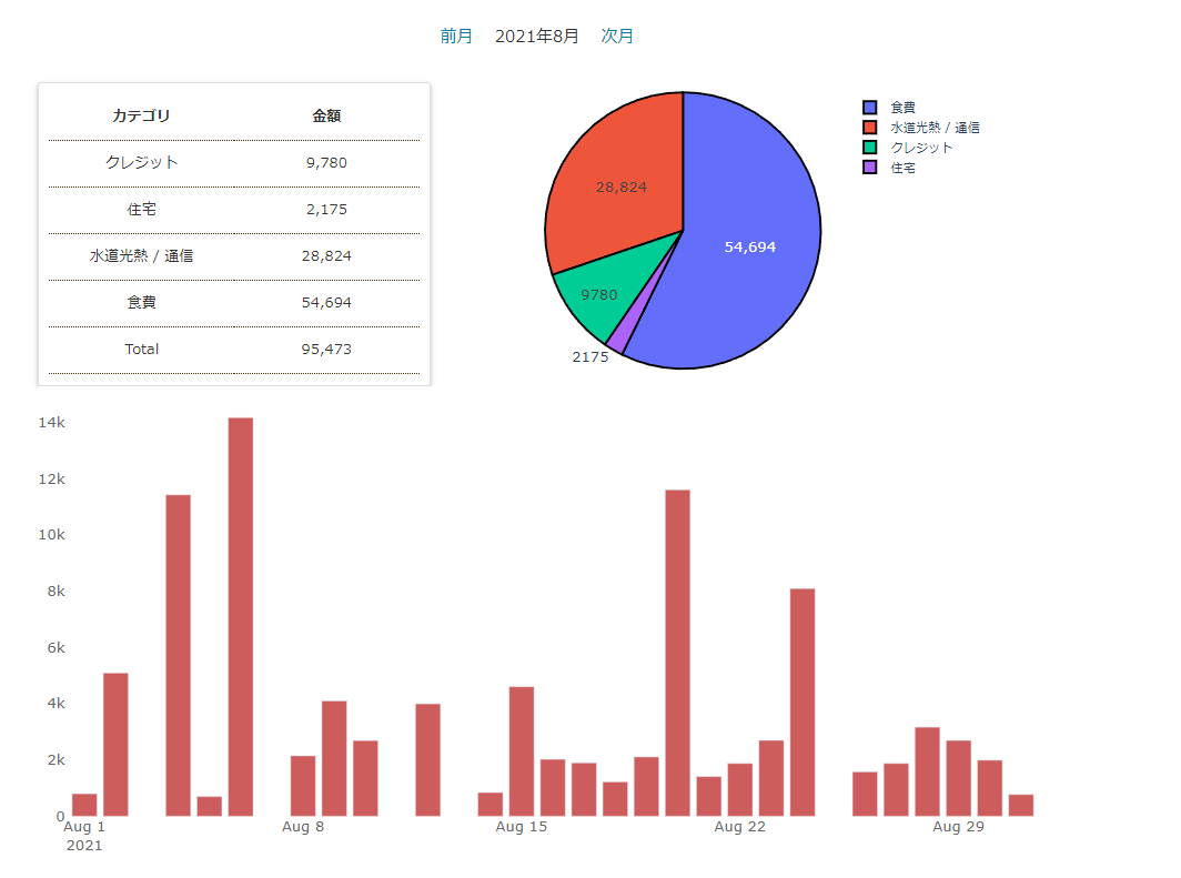
とりあえずグラフを表示することができました。
ツールバーを消す方法
plotlyのグラフはデフォルトでツールバーが表示されます。
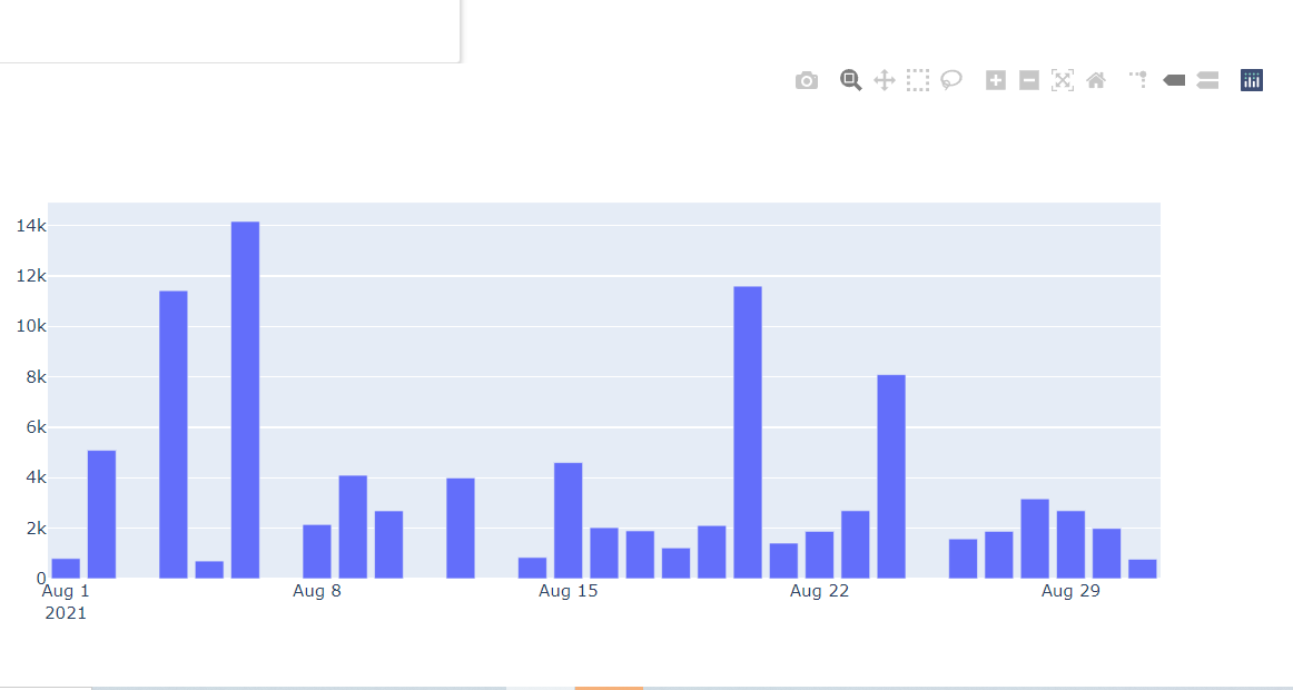
あってもいいのですが、なくしたいというケースもあると思います。
これは簡単でstyleに以下を追加します。
/* kakeibo/static/kakeibo/css/style.css */

...

/* plotlyのツールバー非表示用 */
.hidden_toolbar .modebar {
  display: none !important;
}
そして、以下のようにツールバーを消したいグラフにクラスを適用します。
<!-- kakeibo/templates/kakeibo/month_dashboard.html -->
...
<div class="right ml-4 hidden_toolbar">
    {{ plot_pie }}
</div>
...
<div class="month-dash-bottom">
  <div class="hidden_toolbar">
    {{ plot_bar }}
  </div>
</div>
グラフをおしゃれにする
次にグラフの装飾を行っていきます。
plotlyのグラフはfig.update...とすることで、様々な設定ができます。
plugin_plotlyを以下のように変更します。
#kakeibo/plugin_plotly.py
import plotly.graph_objects as go


class GraphGenerator:
    """ビューから呼び出されて、グラフをhtmlにして返す"""
    pie_line_color = '#000'
    plot_bg_color = 'rgb(255,255,255)'
    paper_bg_color = 'rgb(255,255,255)'
    month_bar_color = 'indianred'
    font_color = 'dimgray'

    def month_pie(self, labels, values):
        """月間支出のパイチャート"""
        fig = go.Figure()
        fig.add_trace(go.Pie(labels=labels,
                             values=values))

        fig.update_traces(hoverinfo='label+percent',
                          textinfo='value',
                          textfont_size=14,
                          marker=dict(line=dict(color=self.pie_line_color,
                                                width=2)))
        fig.update_layout(
            margin=dict(
                autoexpand=True,
                l=20,
                r=0,
                b=0,
                t=30, ),
            height=300,
        )
        return fig.to_html(include_plotlyjs=False)

    def month_daily_bar(self, x_list, y_list):
        """月間支出の日別バーチャート"""
        fig = go.Figure()
        fig.add_trace(go.Bar(
            x=x_list,
            y=y_list,
            marker_color=self.month_bar_color,
        ))

        fig.update_layout(
            paper_bgcolor=self.paper_bg_color,
            plot_bgcolor=self.plot_bg_color,
            font=dict(size=14,
                      color=self.font_color),
            margin=dict(
                autoexpand=True,
                l=0,
                r=0,
                b=20,
                t=10, ),
            yaxis=dict(
                showgrid=False,
                linewidth=1,
                rangemode='tozero'))
        fig.update_yaxes(automargin=True)

        return fig.to_html(include_plotlyjs=False)
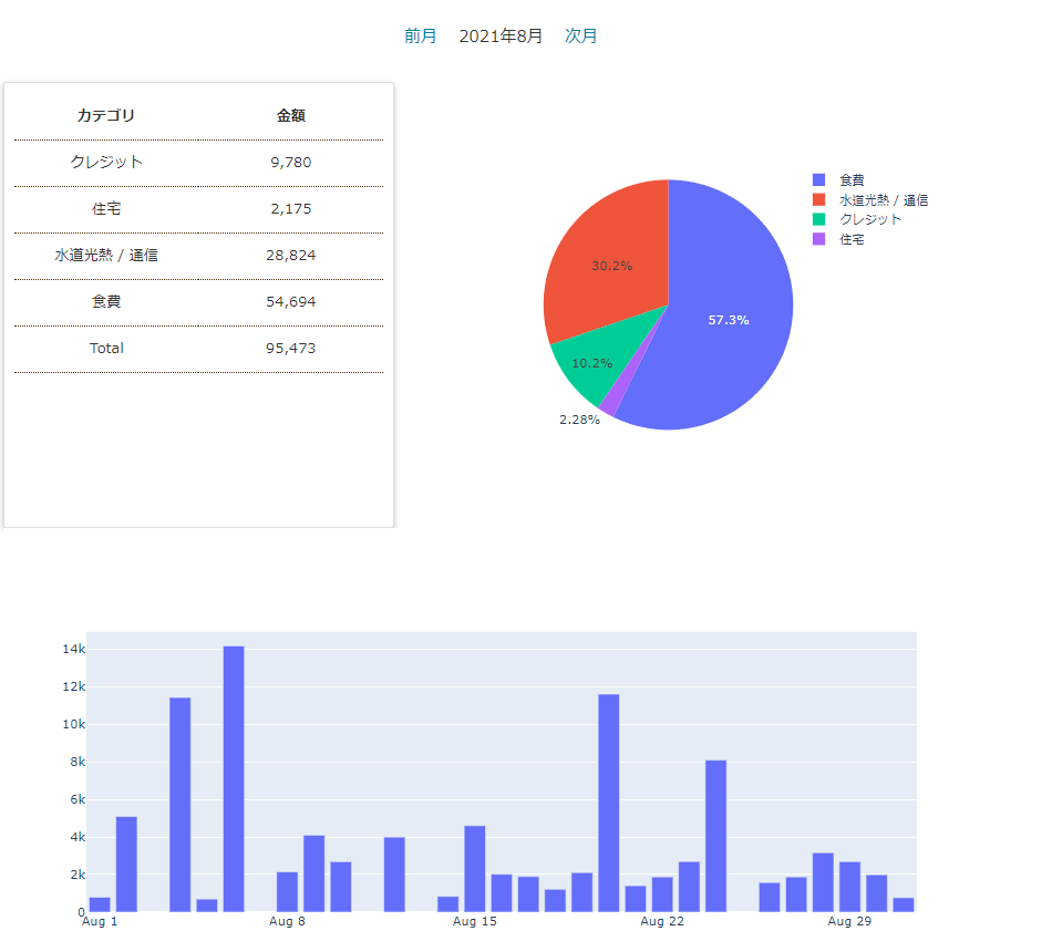
色の情報はいろいろなところに散ると管理が難しいので、クラス変数に定義するようにしています。
大分良い感じになってきました。
カラーパレットを設定する
デフォルトの円グラフの色合いが個人的にあまり好きじゃないので、ひと手間を加えていきます。
plotlyには調べたところカラーパレットが用意されていません。
とはいえ、0から色合いを考えるのは難しいので、グラフライブラリのseabornのカラーパレットを拝借します。
seabornのカラーパレットページ
https://seaborn.pydata.org/tutorial/color_palettes.html
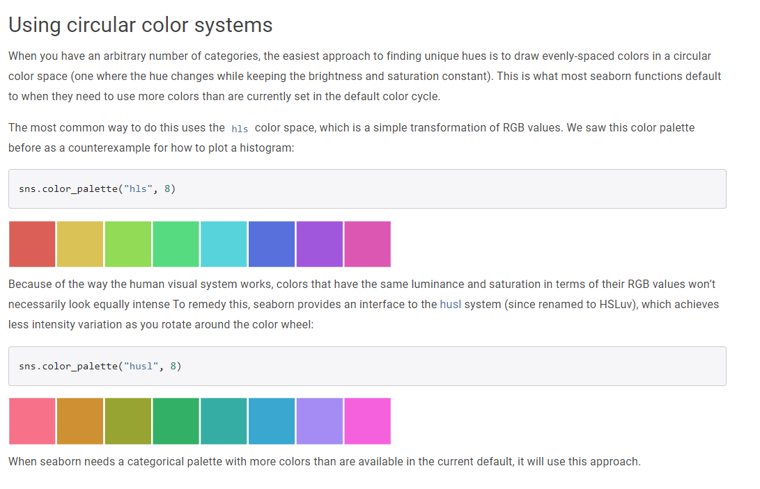
良い感じのカラーパレットが用意されています。
ただし、家計簿アプリでカラーパレットのためだけにseabornを呼び出すのは速度に影響を与えます。
なので、事前にrgb値を書き出して使用することにします。
まず、Djangoプロジェクト外で以下のスクリプトを起動させましょう。
適宜、seabornのinstallをします。
pip install seaborn# プロジェクト外のスクリプト
import seaborn as sns
from pprint import pprint
def get_colorpalette(colorpalette, n_colors):
palette = sns.color_palette(colorpalette, n_colors)
rgbs = []
for rgb in palette:
r = 256 * rgb[0]
g = 256 * rgb[1]
b = 256 * rgb[2]
rgbs.append(f'rgb({r},{g},{b})')
return rgbs
rgbs = get_colorpalette('Paired', 24)
pprint(rgbs)
今回はPairedを使ってみることにしました。
rgb値のリストがprintされますので、プロジェクトのアプリ内にseaborn_colorpalette.pyを作成し、そのままコピペします。
#kakeibo/seaborn_colorpalette.py
"""seadbornのカラーパレットの定義"""

def sns_paired():
    return ['rgb(166.65098039215687,206.8078431372549,227.89019607843136)',
            'rgb(31.12156862745098,120.47058823529412,180.7058823529412)',
            'rgb(178.69803921568626,223.87450980392157,138.54117647058823)',
            'rgb(51.2,160.62745098039215,44.17254901960784)',
            'rgb(251.98431372549018,154.60392156862744,153.6)',
            'rgb(227.89019607843136,26.101960784313725,28.109803921568627)',
            'rgb(253.9921568627451,191.74901960784314,111.43529411764706)',
            'rgb(256.0,127.49803921568628,0.0)',
            'rgb(202.7921568627451,178.69803921568626,214.8392156862745)',
            'rgb(106.41568627450981,61.23921568627451,154.60392156862744)',
            'rgb(256.0,256.0,153.6)',
            'rgb(177.69411764705882,89.34901960784313,40.15686274509804)',
            'rgb(166.65098039215687,206.8078431372549,227.89019607843136)',
            'rgb(31.12156862745098,120.47058823529412,180.7058823529412)',
            'rgb(178.69803921568626,223.87450980392157,138.54117647058823)',
            'rgb(51.2,160.62745098039215,44.17254901960784)',
            'rgb(251.98431372549018,154.60392156862744,153.6)',
            'rgb(227.89019607843136,26.101960784313725,28.109803921568627)',
            'rgb(253.9921568627451,191.74901960784314,111.43529411764706)',
            'rgb(256.0,127.49803921568628,0.0)',
            'rgb(202.7921568627451,178.69803921568626,214.8392156862745)',
            'rgb(106.41568627450981,61.23921568627451,154.60392156862744)',
            'rgb(256.0,256.0,153.6)',
            'rgb(177.69411764705882,89.34901960784313,40.15686274509804)']
次にplotlyのpie chartに適用させていきます。
#kakeibo/plugin_plotly.py

import plotly.graph_objects as go
# 追加
from .seaborn_colorpalette import sns_paired

class GraphGenerator:
    """ビューから呼び出されて、グラフをhtmlにして返す"""
    pie_line_color = '#000'
    plot_bg_color = 'rgb(255,255,255)'
    paper_bg_color = 'rgb(255,255,255)'
    month_bar_color = 'indianred'
    font_color = 'dimgray'
    # 追加
    color_palette = sns_paired()

    def month_pie(self, labels, values):
        """月間支出のパイチャート"""
        # 追加 ラベルの数だけカラーを適用する
        colors = self.color_palette[0:len(labels)]

        fig = go.Figure()
        fig.add_trace(go.Pie(labels=labels,
                             values=values))

        fig.update_traces(hoverinfo='label+percent',
                          textinfo='value',
                          textfont_size=14,
                          marker=dict(line=dict(color=self.pie_line_color,
                                                width=2),
                                      # 追加 円グラフにカラーパレットを適用
                                      colors=colors))
...
このように適用されます。
seabornのカラーパレットはいろいろあるので試してみると楽しいと思います。
次回は同様にplotlyを使って支出と収入の推移ページを作っていきます。
 Share
Share